
From Python to Julia: Basic Data Manipulation and EDA
As an emerging programming language in the space of statistical computing, Julia is gaining more and more attention in recent years. There are two features which make Julia superior over other programming languages.
- Julia is a high-level language like Python. Therefore, it is easy to learn and use.
- Julia is a compiled language, designed to be as fast as C/C++.
When I first got to know Julia, I was attracted by its computing speed. So I decided to give Julia a try, and see if I can use it practically in my daily work.
As a data science practitioner, I develop prototype ML models for various purposes using Python. To learn Julia quickly, I’m going to mimic my routine process of building a simple ML model with both Python and Julia. By comparing the Python and Julia code side by side, I can easily capture the syntax difference of the two languages. That’s how this blog will be arranged in the following sections.
Setup
Before getting started, we need to first install Julia on the workstation. The installation of Julia takes the following 2 steps.
- Download the installer file from the official website.
- Unzip the installer file and create a symbolic link to the Julia binary file.
A detailed guideline on installing Julia is provided in this blog.
Dataset
I’m going to use a credit card fraud detection dataset obtained from Kaggle. The dataset contains 492 frauds out of 284,807 transactions. There are in total of 30 features including transaction time, amount, and 28 principal components obtained with PCA. The “Class” of the transaction is the target variable to be predicted, which indicates whether a transaction is a fraud.
Similar to Python, the Julia community developed various packages to support the needs of the Julia users. The packages can be installed using Julia’s package manager Pkg, which is equivalent to Python’s pip .
The fraud detection data I use is in the typical .csv format. To load the csv data as a dataframe in Julia, both CSV and DataFrame packages need to be imported. The DataFrame package can be treated as the Pandas equivalent in Julia.
using CSV
using DataFrames


data_dir = "data/creditcard.csv"
df = DataFrame(CSV.File(data_dir))
println(size(df))

ENV["COLUMNS"] = 500
df[1:5, :]
Here’s how the imported data looks like.
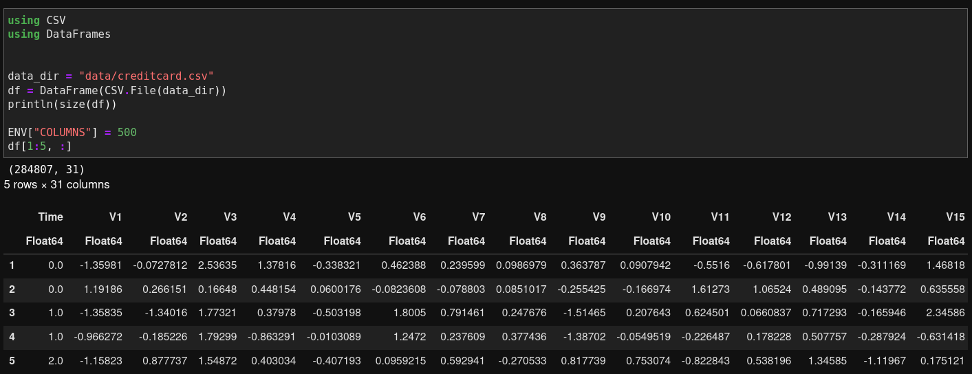
Load data with Julia
In Jupyter, the loaded dataset can be displayed as shown in the above image. If you’d like to view more columns, one quick solution will be to specify the environment variable ENV["COLUMNS"]. Otherwise, only fewer than 10 columns will be displayed.
The equivalent Python implementation is as follows.
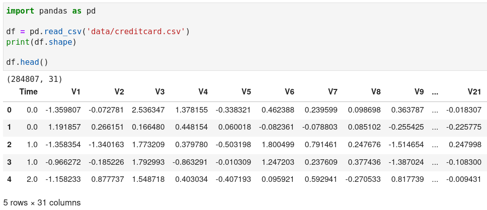
Load data with Python
Exploratory Data Analysis (EDA)
Exploratory analysis allows us to examine the data quality and discover the patterns among the features, which can be extremely useful for feature engineering and training ML models.
Basic statistics
We can start with computing some simple statistics of the features, such as mean, standard deviation. Similar to Pandas in Python, Julia’s DataFrame package provides a describe function for this purpose.
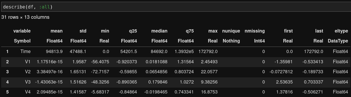
Generate basic statistics with Julia
The describe function allows us to generate 12 types of basic statistics. We can choose which one to generate by changing the :all argument such as describe(df, :mean, :std). It’s a little annoying that the describe function will keep omitting the display of statistics if we do not specify :all, even if the upper limit for the number of displayable columns is set. This is something the Julia community can work on in future.
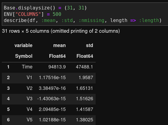
Julia omits printing specified statistics
Class balance
Fraud detection datasets usually suffer from the issue of extreme class imbalance. Therefore, we’d like to find out the distribution of the data between the two classes. In Julia, this can be done by applying the “split-apply-combine” functions, which is equivalent to Pandas’ “groupby-aggregate” function in Python.
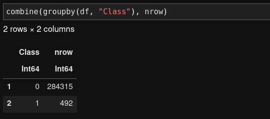
Check the class distribution with Julia
In Python, we can achieve the same purpose by using the value_counts() function.
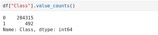
Check the class distribution with Python
Univariate analysis
Next, let’s look into the distribution of features using histograms. In particular, we take the transaction amount and time as examples, since they are the only interpretable features in the dataset.
In Julia, there is a handy library called StatsPlots, which allows us to plot various commonly used statistical graphs including histogram, bar chart, box plot etc.
The following code plots the histograms for the transaction amount and time in two subplots. It can be observed that the transaction amount is highly skewed. For most transactions, the transaction amount is below 100. The transaction time follows a bimodal distribution.
using StatsPlots


gr(size = (1000, 300))
p1 = histogram(
    df.Amount, bins=50, c=:red,
    title="Distribution of Transaction Amount",
    label="" # suppress showing the label
)
p2 = histogram(
    df.Time, bins=50, c=:blue,
    title="Distribution of Transaction Time",
    label="" # suppress showing the label
)
plot(p1, p2)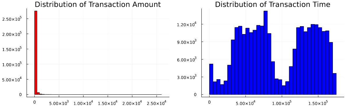
Plot distribution of transaction time and amount with Julia
In Python, we can use matplotlib and seaborn to create the same charts.
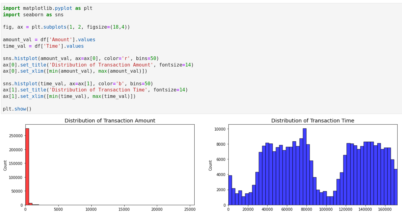
Plot distribution of transaction time and amount with Python
Bivariate analysis
While the above univariate analysis shows us the general pattern of the transaction amount and time, it does not tell us how they are related to the fraud flag to be predicted. To have a quick overview of the relationship between the features and the target variable, we can create a correlation matrix and visualize it using a heatmap.
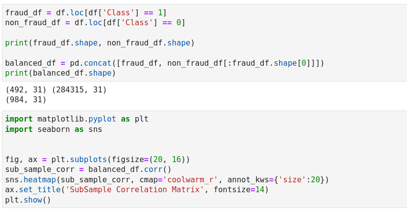
Before creating the correlation matrix, we need to take note that our data is highly imbalanced. In order to better capture the correlation, the data needs to be downsampled so that the impact of the features won’t get “diluted” due to the data imbalance. This exercise requires dataframe slicing and concatenation. The following code demonstrates the implementation of downsampling in Julia.
fraud_df = df[df.Class .== 1, :]
non_fraud_df = df[df.Class .== 0, :]

println(size(fraud_df), size(non_fraud_df))

# Take a subsample of the non-fraud transactions
balanced_df = append!(fraud_df, first(non_fraud_df, nrow(fraud_df)))
println(size(balanced_df))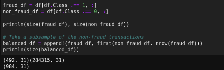
Downsampling in Julia
The preceding code counts the number of the fraud transactions, and combines the fraud transactions with the same number of the non-fraud transactions.
- To create the correlation matrix, we need to convert the features dataframe into a matrix, and use the
corfunction from theStatisticslibrary to calculate the Pearson correlation coefficients in between the features. - Next, we can create a heatmap to visualise the correlation matrix. The Plots library provides a simple implementation.
using Statistics
using Plots


M = cor(Matrix(balanced_df))
gr(size = (1000, 800))
heatmap(
    names(balanced_df), names(balanced_df), M,
    yflip=true, c=:coolwarm, ticks=:all, xrotation=45,
    title="SubSample Correlation Matrix"
)
The resulting heatmap is shown as follows.
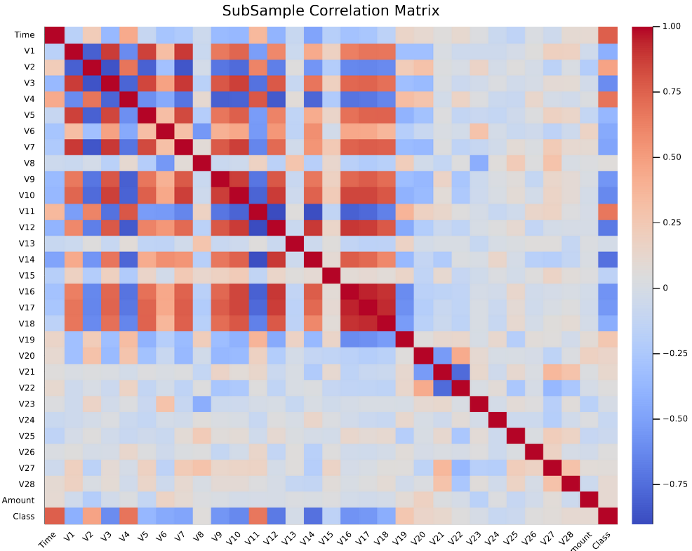
Plot correlation matrix in Julia
Here’s the equivalent implementation of downsampling and plotting heatmap in Python.
Plot correlation matrix in Python
After having an overview of the feature correlation, we would like to zoom into the features with significant correlation with the target variable, which is “Class” in this case. From the heatmap, it can be observed that the following PCA transformed features carry a positive relationship with “Class”: V2, V4, V11, V19, whereas the features which carry a negative relationship include V10, V12, V14, V17. We can use boxplots to examine the impact of these highlighted features to the target variable.
In Julia, boxplots can be created using the aforementioned StatsPlots package. Here I use the 4 features positively correlated with “Class” as an example to illustrate how to create boxplots.
using StatsPlots


p1 = @df balanced_df boxplot(
    string.(:Class), :V2, label="", title="V2 vs Class Positive Correlation", group=(:Class)
)
p2 = @df balanced_df boxplot(
    string.(:Class), :V4, label="", title="V4 vs Class Positive Correlation", group=(:Class)
)
p3 = @df balanced_df boxplot(
    string.(:Class), :V11, label="", title="V11 vs Class Positive Correlation", group=(:Class)
)
p4 = @df balanced_df boxplot(
    string.(:Class), :V19, label="", title="V19 vs Class Positive Correlation", group=(:Class)
)

plot(p1, p2, p3, p4, layout = (1, 4), titlefontsize=9)
The @df here serves as a macro which indicates creating a boxplot over the target dataset, i.e. balanced_df. The resulting plot is shown as follows.
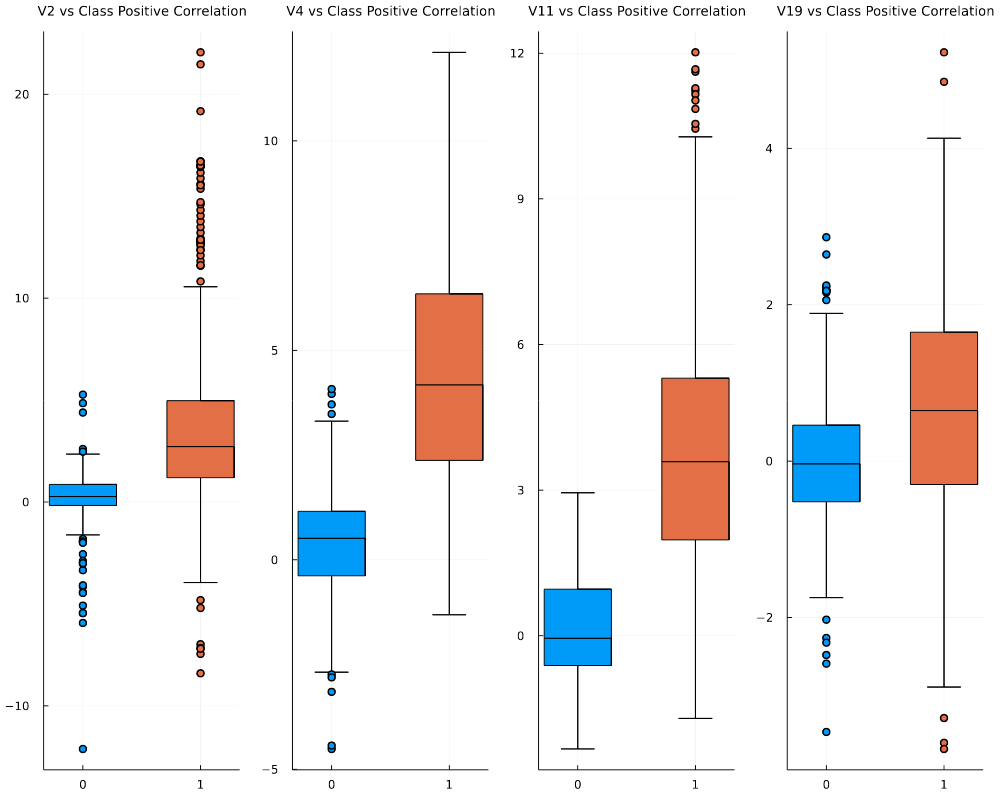
Plot feature vs. class box plot in Julia
The following code can be used to create the same boxplot in Python.
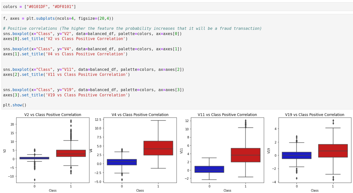
Plot feature vs. class box plot in Python
Intermission
I’m going to pause here with a quick comment on my “user experience” with Julia so far. In terms of the language syntax, Julia seems to be somewhere in between Python and R. There are Julia packages which provide comprehensive support to the various needs of data manipulation and EDA. However, since the development of Julia is still in the early stage, the programming language still lacks resources and community support. It can take a lot of time to search for a Julia implementation of certain data manipulation exercises such as unnesting a list-like dataframe column. Furthermore, the syntax of Julia is nowhere close to getting stabilized like Python 3. At this point, I won’t say Julia is a good choice of programming language for large businesses and enterprises.
We are not done with building the fraud detection model. I will continue in the next blog. Stay tuned!
Jupyter notebook can be found on Github.
Reference
- Credit Card Fraud Detection dataset: https://www.kaggle.com/datasets/mlg-ulb/creditcardfraud